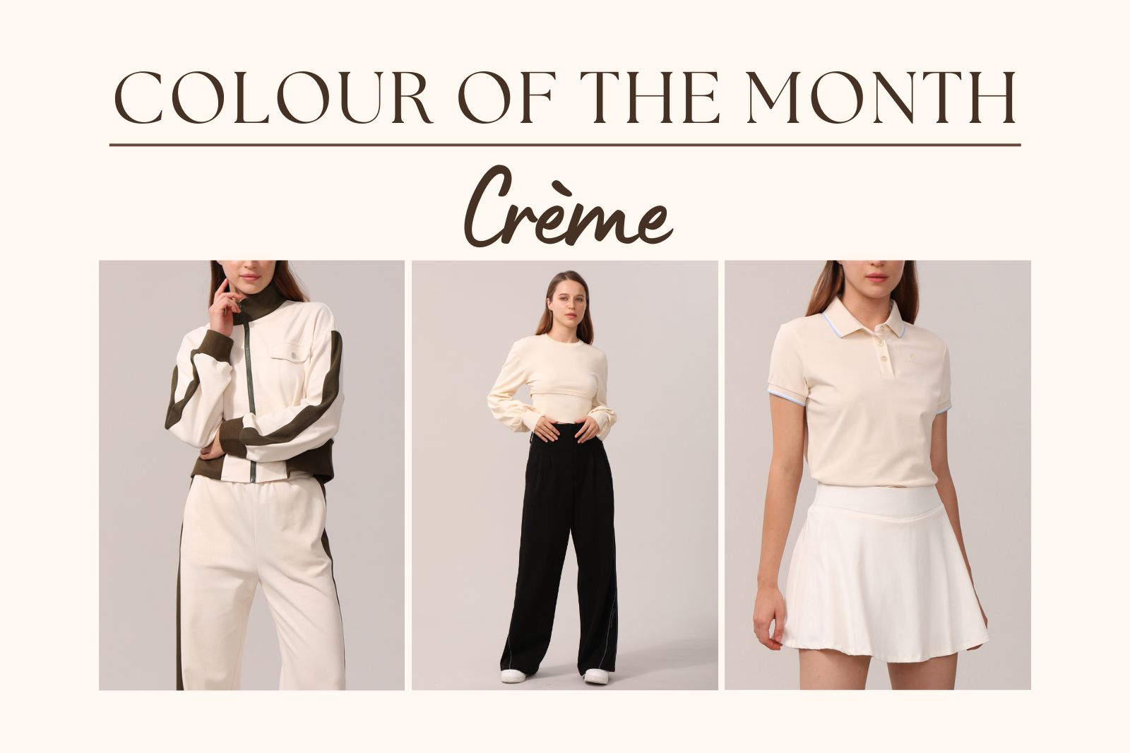
Welcome to Claybourn's latest newsletter series, "Colour of the Month", where we discover and understand how to style colours from our latest collection.
The first colour we are starting with is -- Cream!
You might have noticed the frequent appearance of cream-coloured styles in our delightful collection...
The colour Cream describes the shade of white that resembles natural milk, which has a yellow tint because of the fat content in it.
Let's have a look at what Cream is used in different art forms:

Art
it is commonly used to describe the general skin tone of East and South East Asia.

Interior design
it is widely used as one of the off-white palettes, which gives a more natural look to the space.

Fashion design
the Cream-coloured piece is used to create visual depth when worn with layers. When it is a main piece, it offers a natural, clean, and elegant overall.
How to style cream-coloured clothes?
Light colours are ideal for showcasing the unique silhouette of a garment, as they enhance visibility and highlight its shape.
For a street style look, consider combining light-coloured pieces with loose-fitting pants, allowing the form of the clothing to stand out effortlessly. The cream-coloured polo provides the extra elegance to complete the look.
On the other hand, for a visually striking effect, pair light-coloured items with fitted bottoms to create a captivating contrast.
Pair two natural colours with each other to emphasize the natural visual. The Lifestyle series adopted this rule with its cream x olive green combo, and it is a perfect example of a love-at-first-sight delicate.
Never underestimate the incredible versatility of a polo shirt. Though often hailed as a classic style, its enduring appeal and timeless pastel colour transcend time and it can simply suit most prestigious occasions.
Moreover, it effortlessly transitions into a casual look when paired with a stylish pair of denim shorts
Did the tips help?
Find more styles on our site!


